ブログカードのスタイル(CSS)を変えたので、その記録です。
WordPressからHUGOに乗り換えたので、現在のサイトの状況とは異なりますが、情報として残しております。
▼ プラグインを使わない内部・外部ブログカードの実装方法については、こちら
以前は画像を横に寄せるためにfloatを使っていたのですが、CSS3から使えるようになりブラウザ側の実装も行きわたったgrid要素を使うものに変えてみました。あとは、サムネイル画像の大きさや表示位置やフォントサイズやmarginの調整などなどです。
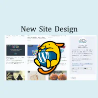
元のスタイル
以前は以下のような構造にしていました。
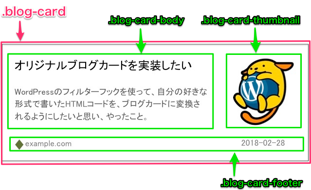
新しいスタイル
新しいブログカードは構造をもう少しシンプルにさせようと思い、functions.phpで定義していたコードも一部書き換えました。
▼ 新しいクラス構造
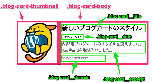
▼ 実例
functions.php
新しいfunctions.phpの内容は以下の通りです。
書き換えたのは、最後の置換する(preg_replace)直前にまとめているHTMLコード部分だけなのですが、わかりやすいように全部のせ。
以前のものをベースに、class名を整理したり非公開Google APIを利用して表示させていたドメインのfavicon画像を取ったりもしました。
/**
* 自作ブログカード関連の設定
* @param   string   the_content(投稿本文)
* @return  string   the_content(ブログカード用に置換された投稿本文)
**/
function original_blog_card ( $the_content ) {

    // 関連情報を取得するための正規表現
    $pattern = '#<span class="bcard (i|e)link"><a href="((?:https?|ftp)(?:://.+?))" title="(.*?)"(?: target="_blank")?>(.*?)</a></span>#';

    // 一致する文字列を取得する
    preg_match_all($pattern, $the_content, $card_matches, PREG_SET_ORDER);
        /* 以下のような配列に格納される
        array(N) {
          [M]=>
              array(5) {
                [0]=> mathced content
                [1]=> $1 : Link type (i|e)
                [2]=> $2 : URL
                [3]=> $3 : Title
                [4]=> $4 : Link Text
              }
        }*/

    if ($card_matches) { //変換する要素があるならば
        foreach ($card_matches as $m) {
                $url = $m[2];
                $domain = parse_url($url, PHP_URL_HOST);

            if ($m[1] == 'i') : //内部リンクの場合
                $id = url_to_postid( $url ); //IDを取得(URLから投稿ID変換)
                    if ( !$id ) return ''; //IDを取得できない場合は脱出

                //global $postの利用
                $post_data      = get_post($id);
                setup_postdata($post_data);
                $title          = $post_data->post_title; //タイトルの取得
                $excerpt        = get_post_meta($id, 'meta_description', true) ? get_post_meta($id,'meta_description',true) : get_the_excerpt($id); //$post_data->post_excerpt; //抜粋の取得
                if ( has_post_thumbnail($id) ): //thumbnail画像のHTML取得
                    $src    = get_the_post_thumbnail( $id, 'cb400-400', array( 'alt' => $title ) ); //thumbnailのサイズ(cb400-400)は自分で定義したものなので、環境に合わせて変えてください
                    $thumbnail  = '<div class="blog-card-thumbnail">' .$src. '</div>';
                else: //thumbnailがない場合
                    $src        = get_template_directory_uri() . '/images/ogp_no_image.jpg'; //ogp_no_image.jpg画像は自分で用意
                    $thumbnail  = '<div class="blog-card-thumbnail"><img src="' .$src. '"></div>';
                endif;
                $date           = date('Y-m-d', strtotime($post_data->post_date)); //投稿日の取得
                $target         = ''; //target="_blank"の設定

                wp_reset_postdata();


            elseif ($m[1] == 'e') : //外部リンクの場合
                //OGP情報を利用する
                require_once('opengraph.php');
                //@link https://github.com/scottmac/opengraph
                //@link https://github.com/AramZS/opengraph

                $graph = OpenGraph::fetch($url);
                if ($graph) : //OGP情報が設定されていたら
                    $title = $graph->title ? $graph->title : $m[3];
                    $excerpt = $graph->description ? $graph->description : '';
                    $src = $graph->image ? cb_fetch_ogp_image_file($graph->image) : get_template_directory_uri().'/images/ogp_no_image.jpg'; //ogp_no_image.jpg画像は自分で用意
                    $thumbnail = '<div class="blog-card-thumbnail"><img class="wp-post-image" src="' .$src. '"alt="' .$m[3]. '"></div>';
                endif;
                $date       = ''; //外部リンクは投稿日なし
                $target     = 'target="_blank"'; //外部リンクは新規タブで

            endif;

                //ブログカードのタグを設定
                $title_tag   = '<p class="blog-card__title">' .$title. '</p>';
                $date_tag    = '<p class="blog-card__date">' .$date. '</p>';
                $excerpt_tag = '<p class="blog-card__excerpt">' .$excerpt. '</p>';
                $domain_tag = '<div class="blog-card__domain">' .$domain. '</div>';
                //タグを合体
                $whole_tag = '<div class="blog-card"><a href="' .$url. '"' .$target. '>'.$thumbnail .'<div class="blog-card-body">' .$title_tag  .$date_tag .$excerpt_tag. $domain_tag. '</div></a></div>';

                //置換する
                $the_content = preg_replace('{'.preg_quote($m[0]).'}', $whole_tag, $the_content);
        }
    }

    return $the_content;

}
add_filter('the_content', 'original_blog_card');
CSS
ブログカードのデザインにあたるCSSは以下のように。テーマフォルダにあるstyle.cssに記述します。
marginやpaddingやline-heightなどは、それぞれのテーマの基本設定に合わせて調整してください。
.blog-card {
    width: 100%;
    max-width: 600px;
    border: 1px solid #dedede;
    background-color: #fefefe;
    box-shadow: 0 1px 3px rgba(0, 0, 0, 0.06);
    margin: 1.6rem 0;
}
.blog-card a {
    line-height: 1.9em;
    text-decoration: none;
    color: #5d686f;
    display: grid;
    overflow: hidden;
}

@media only screen and (min-width: 0) { /*スマホのとき*/
    .blog-card a {
        grid-template-columns: 140px 1fr;
    }
}
@media only screen and (min-width: 768px) { /*タブレット以上のとき*/
    .blog-card a {
        grid-template-columns: 160px 1fr;
    }
}
.blog-card a:hover {
    text-decoration: none;
}

/*ブログカードの左側:サムネイル画像*/
.blog-card-thumbnail {
    grid-column: 1;
}
@media only screen and (min-width: 0) { /*スマホのとき*/
    .blog-card-thumbnail {
        width: 140px;
        height: 140px;
    }
}
@media only screen and (min-width: 768px) { /*タブレット以上のとき*/
    .blog-card-thumbnail {
        width: 160px;
        height: 160px;
    }
}
.blog-card-thumbnail img {
    object-fit: cover;
}
@media only screen and (min-width: 0) { /*スマホのとき*/
    .blog-card-thumbnail img {
            width: 140px;
            height: 140px;
    }
}
@media only screen and (min-width: 768px) { /*タブレット以上のとき*/
    .blog-card-thumbnail img {
            width: 160px;
            height: 160px;
    }
}

/*ブログカードの右側:タイトル・日付・抜粋・ドメイン名*/
.blog-card-body {
      position: relative;
      grid-column: 2;
      padding: 8px 10px;
      overflow: hidden;
}
.blog-card__title { /*ブログカードの記事タイトル*/
      font-weight: 700;
      max-height: 1.9em;
      margin: 0 !important;
      overflow: hidden;
      text-overflow: ellipsis; /*長いタイトルは...で省略*/
      word-break: break-all;
      white-space: nowrap;
}
.blog-card__date { /*ブログカードの記事投稿日*/
      font-size: 10px;
      margin: 0 !important;
}
.blog-card__excerpt { /*ブログカードの記事抜粋*/
      font-size: 13px;
      line-height: 1.6em;
      margin: 0 !important;
      overflow: hidden;
}

/*ブログカードの記事抜粋が長い場合に備えて、高さを指定*/
@media only screen and (min-width: 0) { /*スマホのとき*/
    .blog-card__excerpt {
          max-height: 3.2em;
    }
}
@media only screen and (min-width: 768px) { /*タブレット以上のとき*/
    .blog-card__excerpt {
          max-height: 4.8em;
    }
}
.blog-card__domain {
    position: absolute;
    bottom: 10px;
    font-size: 10px;
    color: #999; }
完成形
以上のように設定すると、このような表示のブログカードになります。
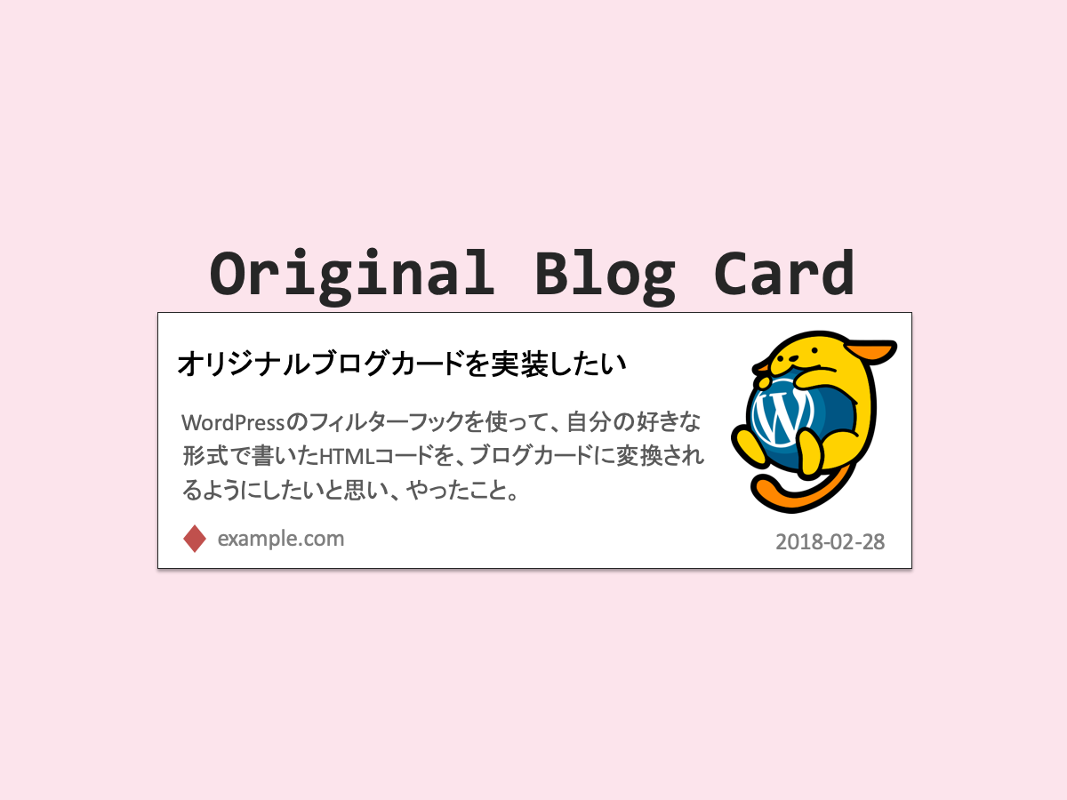
▼ 内部リンクのブログカード例
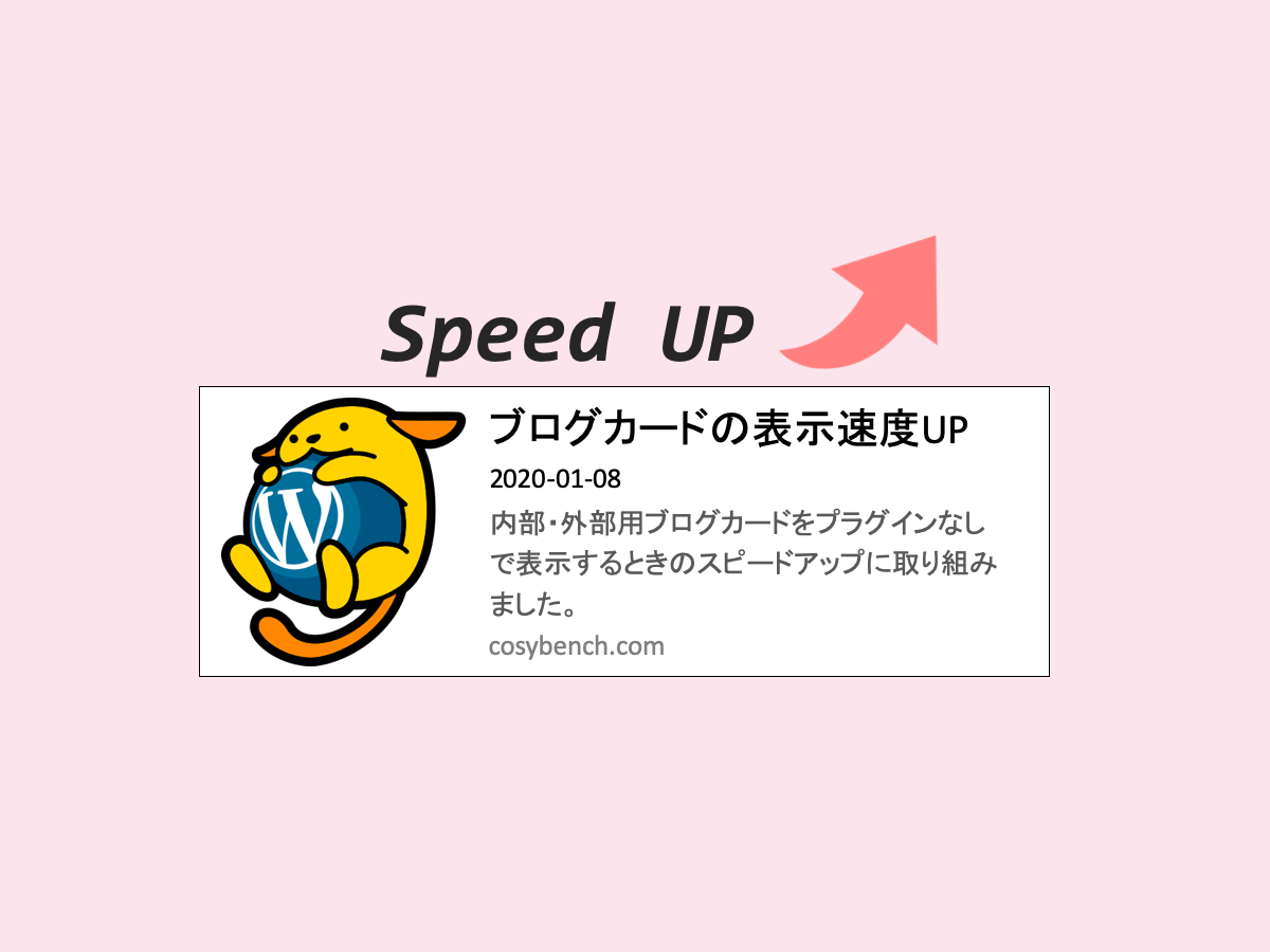
▼ 外部リンクのブログカード例

ブログカード上にカーソルをもっていったときにホワッと画像が大きくなるエフェクトは、WordPressの画像に付いてくるwp-post-imageクラスを利用しています。
外部リンクのブログカードのサムネイル画像にも適用されるよう、functions.php内のコードにあるようにwp-post-imageクラスを付け加えています。
/*hover時のエフェクト設定*/
img.wp-post-image {
  transition: all 1s cubic-bezier(0.165, 0.84, 0.44, 1);
  transition-timing-function: cubic-bezier(0.165, 0.84, 0.44, 1); }

a:hover img.wp-post-image {
  -webkit-transform: scale(1.03);
  transform: scale(1.03); }
まとめ
CSS3から出てきたdisplay: grid、とっても便利だなと使ってみて思いました。
飽きがくるまでしばらくは、このブログカードスタイルでいってみます。
